



Design System Scalability Made iPhone Duo Possible
Apple arrived years late to foldables. iPhone Duo still looks like a product-design win because the design system was already scaling across iPhone, iPad, and Mac — so most apps were ready before the hardware existed.
- Top-tier hardware is the price of admission after a seven-year delay; the real bet is software that already knows the next device.
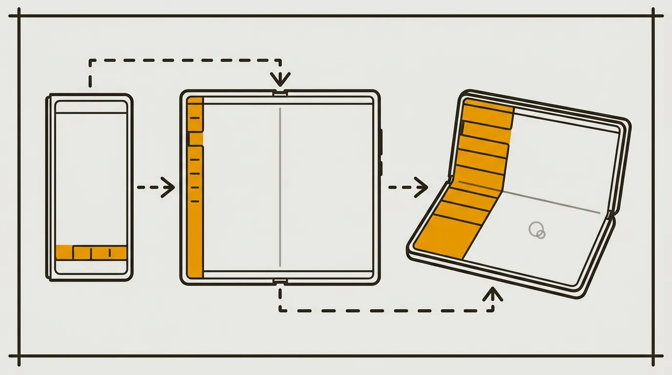
- A weird cover-screen ratio gets solved by moving navigation to the right, leaving apps a near-normal iPhone canvas with no extra developer work.
- Opened, Duo reuses iPad multitasking, Mac and iPad sidebars, and StandBy — new poses, old behaviors.
- The open question is not craft. It is whether foldables have a job people will pay for, especially outside China.
Arriving seven years late to a hardware category is usually a product death sentence. Foldable phones are no longer a novelty: Samsung Galaxy Fold opened the door, Chinese brands followed, and the form factor has had time to get ordinary. Apple announced iPhone Duo at its September 2026 keynote anyway — its first foldable — and treated the delay as a design window rather than an apology.
The interesting move is not “finally ship a Fold.” It is that design system scalability did the heavy lifting. Hardware had to be excellent. Software had already been rehearsing the device on other screens.
Design System Scalability Starts Years Before Hardware
When you show up late to a category, top hardware is the ticket in. A design system that already scales across devices is what makes the product coherent on day one.
On hardware, Duo is meant to look like the best Fold you can buy today. The crease between the two halves is barely visible — the problem foldables have fought since the beginning. Bezels are relatively thin for the category. It inherits Apple’s in-house chips. There is an under-display camera, which has been a weak spot on every phone that tried it; here it is not a triumph either, just about average for the technique, but it does something most foldables still fail at: a real tablet canvas once the device is open.
That is the minimum for credibility this late. It is not enough to make Duo a good product.
The actual bet is software. Most foldables stall there. Android is a more open ecosystem, with far more devices, none of them owned by a single brand, so customizing the experience is harder. Apple runs one OS end to end. It already scales across iPhone, iPad, and Mac, and the screen formats have been getting more coherent, not less. The development kit automates the jump between those devices. Design and build an iPhone app with native design-system components — the tab bar, buttons, navigation behaviors — and they transform into something that fits iPad, then Mac, without a second or third layout to rebuild.
That is design system scalability in practice: ship components that already know the next device. Duo is what happens when that work is several years ahead of the hardware.
Cross-Device Product Design Fixes the Cover Screen
A cover screen with a weird ratio is a hardware problem. Putting navigation on the right is the software fix — and it only works if components can relocate themselves.
Closed foldables often leave you with an awkward cover display: usable, but not a format people already know. Apple did not wait for a more conventional panel. It moved navigation to the right of the screen instead of the bottom. The remaining canvas gets a normal ratio, so apps render close to how they already render on iPhone.
That is cross-device product design used as a workaround. Navigation is not the body of the app; it is chrome. Park the chrome on the side, and the content area stops looking like a special-case Fold. Developers do not implement that shift. Native components move and re-anchor themselves. The OS owns the placement.
Liquid Glass is part of why the move feels logical. It was criticized last year for accessibility problems that have been fixed over time, but the visual system is the point here: tab bars and similar controls already float above the rest of the interface. Sliding that floating layer to the right is a continuation of the system, not a one-off foldable hack. The components were designed a few years early so new devices would not require a new paradigm.
One warning, and it is a real one. Navigation lands on the right. I have not seen an accessibility mode that puts it on the left for left-handed people. Camera placement and other hardware constraints are part of the reason. For a company that usually takes accessibility seriously, that gap is surprising. It is worth watching whether it gets a proper answer in the coming months.
The cover screen is otherwise a clean combo: hardware constraint, software solution, no extra work in the app.
Same cover screen, two navigation layouts
The leftover canvas is the product. Click a pattern.
Nav at the bottom
Nav on the right
Foldable UX Patterns Already Lived on iPad and Mac
Opened, Duo is almost an iPad mini. The foldable UX patterns that matter — multitasking, sidebars, StandBy — were already shipping on other Apple devices.
Unfolded, the inner display is close to iPad mini. Apple did not invent a third OS for that canvas. It reused behaviors that already exist.
iPad multitasking has been under real work for years. Duo open uses the same behaviors. Any app that already supports iPad multitasking is already ready: resizing, split views, the whole package, with nothing extra for developers. Shipping a new device with a majority of apps already compatible with that multitasking is a distribution advantage most hardware launches do not get.
The sidebar follows the same logic. On Mac and iPad, a side navigation bar is already the native way through a lot of apps. Mail is the clean example: on iPhone you reach navigation from a control in the top left; on Mac and iPad you get a sidebar. That adaptation already has three levels — iPhone, iPad, Mac — and Duo inherits it if the app was using native patterns.
The finish is that the same sidebar is retuned to three opening states of the phone:
- Closed. Classic iPhone navigation.
- Fully open. The same pattern as iPad or Mac: the sidebar takes about 20% of the screen width.
- Partially folded, like a notebook. Navigation takes the entire left display; interaction takes the entire right. You cannot work on the crease, so the system stops pretending there is one canvas.
StandBy is the same reuse in a different pose. It landed on classic iPhone three or four years ago: charge the phone, lay it on its side, and widgets become the interface. Developers have already spent those years making apps compatible. Fold Duo into an easel, and StandBy is what you get. No new surface to design for. Existing widgets already apply.
The line I keep coming back to: everything is new, nothing is new. The foldable UX patterns look like a launch. They are a three-year rollout that made sure Apple’s software — and the apps in the ecosystem — could absorb the complexity before the hinge existed.
That planning is hard for most companies. The transferable method is smaller than “be Apple.” Every time you design something, ask what the next one, two, or three steps are. Not version 2, 3, and 4 of the same project. How this decision could help a future initiative on the other side of the company.
One sidebar, three hinge states
Native navigation follows the fold. Click a pose.
Closed
Folded, Duo behaves like a classic iPhone: the same navigation pattern people already know on a regular phone.
Fully open
Opened, it matches iPad and Mac: a sidebar that takes about 20% of the screen width, with the app body on the rest of the canvas.
Notebook fold
Partially folded, navigation takes the entire left display and interaction takes the entire right. You cannot work on the crease, so the system stops treating the inner screen as one surface.
Quick check
Why were most existing apps already usable on iPhone Duo’s inner display?
Duo reuses iPad multitasking, Mac and iPad sidebars, and StandBy. If an app already followed native patterns, the new poses did not require a new app.
A few details are there for delight, and they still do a product job. The transition between closed and open is beautiful: it makes the two states feel like one device instead of a phone glued to a tablet. In the easel pose, StandBy as a bedside clock is a plausible use. The inner screen, facing the table, washes the surface in a soft orange light — the kind of image that travels because nobody else thought to light the furniture. Pure delight, yes. Also marketing: it makes Duo look more considered than the competition, and it gives owners a moment they will want to show.
Foldable UX Patterns Still Need a Job to Do
Craft can be ready on day one and the product can still miss if nobody can say why they would pick it over a regular iPhone.
Until now this has been praise. The hole is usage. Why take Duo instead of an iPhone Pro, an iPhone Pro Max, or a regular iPhone? Apple’s own presentation does not make that obvious. Sales of other foldables do not either. Price is a blocker we should not skip. Foldable use cases are still poorly identified, and they have not really convinced so far.
That is a Vision Pro-shaped risk: an expensive object whose differentiating jobs never quite justify the cost and the drawbacks. Apple Vision Pro locked people into a virtual world that is socially awkward, with battery life and weight on the head as extra friction. Duo has its own list: price, fragility, a format people are not used to. It could fail to find a market.
Some products start with muddy use cases and find one later. Apple Watch launched with a pile of possible jobs; most of them never became the product. Over generations, health and sport did. It now has a loyal base, often tightly focused on those two. Apple accepted a second Vision Pro-style flop as a live possibility, and shipped Duo anyway.
There is a coherent reason to. China is about 40% of the global foldable-phone market. Foldables work there, and not by accident. Usage is mobile-first. About 80% of Europeans have a personal computer at home; about 45% of Chinese people do. In Europe, complex work still migrates to a computer. In China, the phone is the primary device, including for filing taxes or planning a trip — jobs a larger screen actually helps. Gaming splits the same way. In Europe, mobile is still mostly mini-games, and not especially a transit habit. In China, full-scale mobile games are a real practice, including on public transport and in public places. More screen is simply a better way to play.
So the product has jobs there. Whether those jobs migrate to Europe is an open question. Europe is currently the smallest foldable market; North America is not far ahead. Watching the rest of the world is how you see why a product can stall at home and work elsewhere — and sometimes how your own usage will look next.
One more candidate, still a question more than a claim: agentic work. Producing and reviewing content with an LLM is a poor fit for a laptop-only ritual and a cramped phone. A foldable might be the mobile device that actually fits that loop. I do not know yet. It is the right kind of question to keep open.
The design lesson does not wait on the sales chart. Arriving late, after years of systematic design so the software — and third-party apps — could absorb the device, is still a strong way to ship a new form.
Final Thoughts
Everything is new, nothing is new. That is the sentence I would steal for any product org that keeps treating each surface as a blank page. Design the current thing so it can carry the next one, two, or three steps — not a roadmap of versions, but a contribution sitting in wait for a future initiative. iPhone Duo is late hardware riding an early design system. Whether the market shows up is a different problem. The method still travels.
FAQs
Why is software a bigger iPhone Duo advantage than hardware?
The hardware had to be top of the foldable class to be credible after a seven-year delay, but Android foldables already exist. Apple’s edge is one OS that already scales native components from iPhone to iPad to Mac, so apps adapt without a new layout for Duo.
How does iPhone Duo fix the awkward cover-screen format?
It moves navigation to the right instead of the bottom. The remaining canvas is close to a normal iPhone ratio, so apps display as people already expect, and native components relocate themselves with no extra developer work.
Which existing Apple behaviors does iPhone Duo reuse when it is open?
iPad multitasking, the Mac and iPad sidebar (about 20% of width when fully open, a full left pane in the notebook fold), and StandBy when the phone is in an easel pose. Apps that already supported those patterns were ready.
Why do foldable phones have a clearer job in China than in Europe?
China is about 40% of the global foldable market and is more mobile-first: about 45% of people have a personal computer at home, versus about 80% in Europe, so complex tasks and larger mobile games already happen on phones. Europe is currently the smallest foldable market.