


How to Design MCP Apps for Agentic UX
Talking to an AI still feels like sending messages into a text box. You type. It types back. Sometimes it returns an image, a video, or a reading of a document you uploaded. That is useful, and it is also a ceiling: the model can describe a FigJam board, a set of screenshots, or a restaurant slot, but it cannot show you the thing you actually need to judge.
That ceiling is now a product surface. MCP App design lets you ship a custom visual interface inside ChatGPT, Claude, or any other AI agent—so the reply is no longer limited to text and images. I built one for my screenshot benchmark library for product people, and the same pattern applies to almost any product that currently dies in a text-only thread. The work is not “add a widget because AI is trendy.” It is agentic UX: designing a small, contextual interface the model can insert into a conversation when text is not enough.
MCP App Design Starts Where Text Falls Short
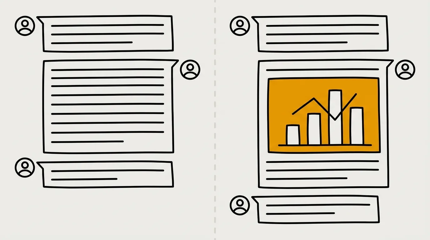
Key Takeaway: A regular MCP connects an AI to your product; an MCP App is the visual window that product can push into the chat itself.
The first generation of product-to-AI work was Model Context Protocol connections: a technical bridge. Some design is involved, but there is no visual interface. Jira is the clean example. Their MCP lets an AI read, modify, and create tickets. Ask where a set of tickets stands, and the model can fetch them and answer in prose. You get a bridge between an agent and a tool you already work in. You do not get a dedicated UI for that work. The content of the answer stays text.
MCP Apps change that. They work with ChatGPT, Claude, and plenty of other agents. The model can still reply with text and images, but it can also push a concrete visual interface from the software you are interacting with. If someone asks the LLM something related to your product, it can display a fully custom window directly in the chat.
Figma was among the first to ship this. Ask ChatGPT to work with a FigJam canvas, and the agent can make the edits and show the FigJam canvas in the conversation. Describing the edge of a FigJam board in paragraphs is a poor interaction. Showing the board is not.
I used the same idea on my screenshot benchmark library. The MCP can search screens, write descriptions, and return benchmark content. It can also open a dedicated window in the chat with every screenshot it retrieved. Instead of a text-only analysis, or two or three images dropped into the thread, you get a carousel with dozens of screens plus the agent’s write-up. That is the point of MCP App design: visual access sitting next to the analysis, not instead of it.
Reservation flows make the same gap obvious. Booking a hotel or a restaurant over text is awkward because text does not carry availability, or price by day, or the rest of the context you would normally scan. Dropping an advanced calendar picker into the chat is often more effective than asking someone to choose a slot blindly. MCP Apps are a new medium: custom visuals you design, included directly in the agentic interaction between an AI and your product.
MCP connection
MCP App
Agentic UX Lives Inside the Chat, Not Beside It
Key Takeaway: An MCP App is a tool the model may insert into a reply—you do not control if it appears, where it sits, or whether it survives the next message.
Before you draw a single rectangle, understand the display context. You get a dedicated space, but it is a limited window inside a chat UI: ChatGPT, Claude, or another agent. You are designing within that chrome, not around it.
The second constraint is how the model uses it. An MCP App follows tool logic. Each time the user asks something, the AI answers—and at that moment it may call your app and place it in the reply, before the text, after the text, in the middle, or not at all. You have no hand on that decision. The small window you design is an element of the answer, entirely at the AI’s disposal.
That also means persistence is not yours to promise. If the model includes your MCP App in the first reply and the user sends a second prompt, the window disappears into the rest of the chat. It is not a tool open in parallel with the discussion. It is not an overlay on top of the thread. It is a small window included in the conversation, then scrolled away like any other turn.
So the first real step in agentic UX is not Figma. It is going to look at existing MCP Apps—and use them—until the constraints are obvious. You cannot design a surface you have never seen fail.
User prompt
AI may call the MCP App—or skip it
Window in the reply: before, after, or inside the text
Next message: the window scrolls into history
Conversational Product Design: Prototype in the Chat
Key Takeaway: Identify a task text cannot serve, then prototype the MCP App inside a realistic agent thread—not as a standalone product screen.
Use-case work is still product work, with one twist: the interface is an agent. Ask which task a user of your product would want to complete from that agent, then which of those tasks would fail if the person were limited to text—both for reading information and for selecting or prompting into your product. That takes user research and market research. Do not design an MCP App just to have designed an MCP App.
Once you have a job worth doing, you can prototype two ways.
A static prototype in Figma—or any design tool—works surprisingly well. Two rules matter. First, start from the UI of an AI. Your app will live inside that chat, so you cannot ignore it. Pick ChatGPT, Claude, or whichever agent you care about, take that frame as the starting point, and design inside it. Second, put the MCP App in a coherent flow: show the user prompt as it would appear in that agent, show the AI reply as it would appear, and only then drop in your app. It is literally a rectangle you can fill. You need a prototyping environment that matches the final user flow. Designing the MCP App as a static screen of your existing product, then imagining it later inside a conversation, is the wrong sequence. Place it in context from the first frame. Your design space has to match the user’s final reality.
Technically, that rectangle is an iframe. Size is yours. Visual style is yours. Content is yours. It can be as interactive as your actual application: 3D models, drag and drop, whatever the job needs. Inside the rectangle you are free. Around it, you are still in someone else’s chat.
Because of that, a classic Figma prototype is not a downgrade. You are close to designing a normal app or site; you are just doing it inside a thread. The second path is to vibe-code an MCP App. There is an official Claude Code plugin, built by the organization that manages MCP Apps, that simplifies and speeds up development with an agent. Getting a working app is relatively easy. Testing one is not: it is complicated and tedious. If you are reasonably technical, try it—you learn more with your hands in the real surface. If you are not, skip it for now, or at least start with a conventional Figma prototype. You will ship thinking faster than you will while debugging the test harness.
After the prototype, the process is the one you already know: test, iterate, measure.
Then avoid the large mistake: stuffing your entire product into an MCP App. That is not the job. Recreating a full app in a poor little window traps people in a surface they already use larger elsewhere, and it fights the usage context. An MCP App should answer one interaction in a conversation, not host the product.
The organization behind MCP Apps has already flagged the jobs where a visual layer pays off:
- Exploring complex data. Sales figures sliced by country or currency are technically possible in text, but the interaction gets cramped. A visual interface lets people dig further, faster.
- Configuration with multiple choices. A reservation slot is not one parameter. Availability, price that day, seating—an interface often beats a blind text choice.
- Actions that need many fields. If validating an action takes ten pieces of information, a form is better than an AI asking ten follow-up questions.
- Complex media. A 3D model, an interactive preview, a PDF you can review and comment on: interact with the thing, do not describe it.
- Live data. A score or status that updates in place beats asking the model every two minutes where things stand.
- Multi-step workflows. When the path has several stages, an interface usually makes sense.
The pattern underneath is simple: MCP Apps earn their keep when text is not enough to send or receive information efficiently. Treat each app as a tool—one element of a reply. You can ship several MCP Apps for several use cases, and the model can show them contextually depending on the discussion. That is conversational product design, not a mini version of your homepage.
There is one more risk, and it is product risk: building for nobody. As of July 2026, MCPs are still lightly adopted by the general population. Developers and people who run code agents use them. Everyone else, much less so. Before you start, estimate how many users you would actually reach. If this is a business project, an MCP App is probably not the right thing to prioritize today. If it is a tech exploration, or a positioning bet—you want to show you are AI-driven and you are willing to invest in a future surface even with few users now—that is a different call.
Keep a product head anyway. Does this answer a need? Is the impact-to-effort ratio good? The moment you start from “let’s design an MCP App,” you are already solution-first: tech-driven, then hunting for a need the solution might fit. That is inverted product thinking. Ask the need question before you put hands on the iframe.
Even when the business case is weak—and it often will be—the surface is still worth exploring on the side. New interaction spaces are how you stay current, see what is being built, and form a point of view. A company can also take a lighter position now so it can ramp faster when the audience is actually there.
Final Thoughts
MCP Apps are a new canvas inside a chat, not a new home for your entire product. Design for the jobs text cannot do. Prototype inside the agent UI. Accept that the model—not you—owns placement and persistence. And keep the product question in front of the iframe: is this a need, or just a new medium looking for one? The teams that learn this surface now will be the ones who already have taste for it when the audience finally shows up.
FAQs
What is the difference between an MCP and an MCP App?
An MCP is a technical connection that lets an AI read and act on your product, with answers that stay in text. An MCP App adds a custom visual window the model can insert into the chat, the way a FigJam canvas or a screenshot carousel can appear next to the written reply.
Do you control when the MCP App shows up in the conversation?
No. The AI decides on every reply whether to call your app, whether to show it, and whether to place it before, after, or inside the text. After the user’s next message, the window scrolls into the chat history. It is not a parallel tool and not an overlay.
Should you rebuild your whole product as an MCP App?
No. An MCP App should serve one conversational interaction, not replace the full product in a small window. Ship several focused apps for different jobs if you need to, and show them contextually.
Who is actually using MCP Apps today?
As of July 2026, adoption among the general population is still low. Usage is concentrated among developers and people who already work with code agents. Estimate reach before you treat this as a core business project.