



Preference Testing That Tests Hypotheses, Not Taste
“Which design do you prefer?” is not preference testing. It is the most common way people run it, and it is the reason the method gets dismissed.
Preference testing is the practice of collecting qualitative feedback across several versions of a solution. You do it upstream — sometimes very upstream — so the team can pick a direction before anything ships. It is not an A/B test. A/B testing happens in production, with precise metrics and KPIs. Preference testing happens earlier, on purpose: you want qualitative signal that sends the project one way rather than another.
Used naively, it is a taste contest. Used as a UX research method, it is one of the sharper tools you have when a high-stakes product decision has to be made before you have traffic to measure.
Preference Testing Is Not Asking What Users Prefer
Key Takeaway: Preference testing works when you validate a precise hypothesis with a defined audience — not when you ask people which option they like more.
The baseline mistake is to apply the name literally. You put two options in front of someone and ask what they prefer. That fails for several reasons, and they stack.
On the user side, it is hard to form a useful opinion without being an expert, without seeing the stakes of the feature, and without the global context of the project. It is hard to project real needs onto what is on the screen, and harder still to understand everything that is being presented in a limited window of time. You get a context problem and a projection problem at the same time: people cannot honestly imagine future use from two isolated artifacts.
Then there is the word itself. “Prefer” is unstable. Does it mean more attractive? Does it mean I feel more at ease, I recognize myself more? Does it mean I prefer the words and the content? It can mean all of those things. If you ask that kind of question, you will get an uninteresting answer.
Effective preference testing still compares versions. The difference is the job. You go there to validate hypotheses that are global in scope and precise in wording. Not “which one do you like,” but a criterion you can actually investigate.
A valid hypothesis sounds like this: which interface is the most reassuring for a new user? You have a target — a new user — and a precise claim to test: which option feels more reassuring. You can ask questions about that, and you can collect real feedback on what seems most reassuring. That is a hypothesis preference testing can carry.
Another one: which interface is the most readable in a work context for a given type of worker? Again, a specific context, a specific audience, and a specific quality you want to compare across options.
A third that also works: which information is most important in an interface? The hypothesis is clear. You are looking at information priority, and you compare several interfaces against that criterion.
You need a precise, measurable goal that sits outside taste. Taste is unique to each person. It will not tell you much.
Which design do you prefer?
Users are not experts, and they lack the feature’s stakes and the project’s global context.
It is hard to project real needs onto what is shown, in a limited window of time.
“Prefer” can mean aesthetics, comfort, familiarity, or wording — so the answer is unstable.
Which interface is the most reassuring for a new user?
A defined audience, plus a precise criterion you can actually investigate.
Most readable in a work context, for a given type of worker
Which information is most important in the interface
A precise, measurable goal outside taste — taste is unique to each person
A UX Research Method for Running Preference Testing Sessions
Key Takeaway: Walk people through each option with questions tied to your hypothesis, randomize the order, then close on a concrete production choice — not an abstract preference.
A few months ago I ran a preference testing session while we were designing an interface to configure recommendation algorithms. The product was highly specific. The audience was e-merchandisers. We were at the very beginning of the project: several ideas for how the interface might work, and no confidence in the direction.
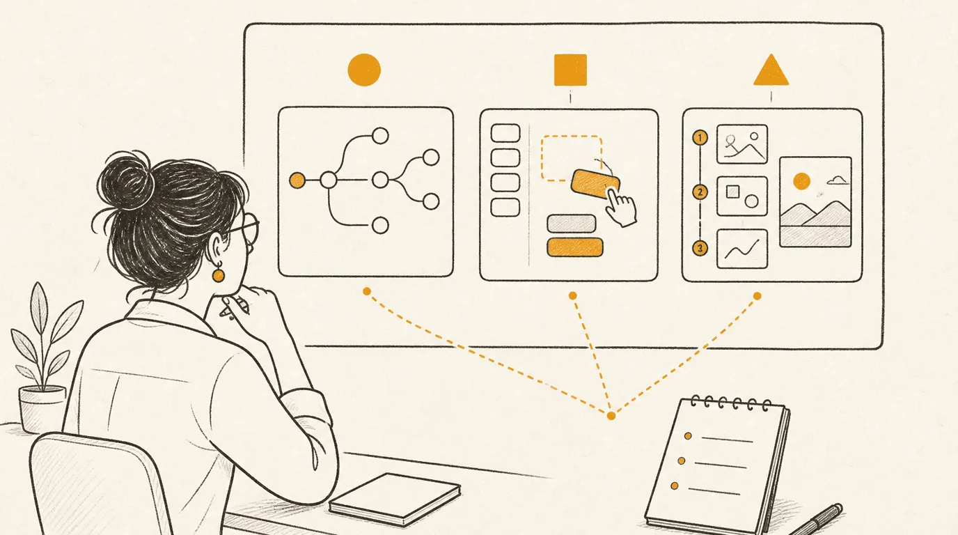
We designed three screens that were extremely different from one another. All three did the same job. The advantages and disadvantages were not the same at all.
The first was a branch system inspired by Zapier: combine algorithms and operators to generate the algorithm and its results. The second was more straightforward, and a bit more basic — a drag-and-drop of blocks for building those algorithms. The third was a configurator sliced into steps, with a live preview.
The hypothesis was equally clear. Which type of interface speaks most to our target users? Which type will be the most reassuring, and the simplest, for welcoming those users?
We recruited against standard UX research practice, and against a precise target: people who matched the criteria of the end users of this interface, and, in our case, potentially purchasers of the product as well.
Then the session itself. A classic welcome, followed by the minimum of context on the situation the person would be in when facing this interface. The point is not to over-contextualize. Too much framing biases the results. You give the few steps that led to this state of the product — enough that the person is not dropped into something they cannot understand, not so much that you have already sold a direction.
A useful way to get there is to contextualize through pre-questions rather than through a speech. Ask how they currently do this operation — even better, how they do it step by step today, and where they start. Let them walk themselves toward the place you are about to present, so your wording does not bias the content. Then project them: imagine that tomorrow you just clicked “Create a new algorithm.” Here is where you land. We were not testing out-of-context comprehension of a screen. We also did not bias them toward the branches we had already explored.
Each screen comes one after another. The method we used: display a screen for one minute and let the person look at it, explore it quietly, with no noise and no discussion. After that minute, keep the screen visible — in our case, on screen share — and ask three questions:
- What do you understand from this screen?
- Which elements create confusion for you in this screen?
- What information is missing in this screen?
Then you repeat with the second prototype and the third. In our case they were static images. There was no interaction.
Those three questions matched the hypothesis we wanted to dig into. You should adapt them to the hypothesis you are actually testing. You should also randomize the order in which you present the screens for each person. The third screen is often easier to understand than the first, because the previous ones already supplied context. If you always go prototype 1, then 2, then 3, a panel of ten users will share the exact same bias. A little randomness will not erase it. It will balance it.
After those rounds, close with a final question: among these three options, which would you want tomorrow in the production application? The job of that question is to project people into a concrete choice — what they would actually find in the product — not into an abstract preference. Answers often come out mixed. Dig into why they want that mix: mixes are always hard to build in reality, and they are still some of the most interesting answers you will get.
That is the template I followed. Adapt it. Change the questions. Change the display time. We left each screen up for a minute because the product was relatively complex. If you are testing something much simpler, or you are testing readability, shorten that window so it matches the real context of the person the day they meet this kind of interface.
A preference testing session — click each step
A few rules sit around that template, and they matter as much as the questions.
On the number of solutions: two is fine. Three is fine, and it is the maximum I recommend. One is pointless. Four, five, or six becomes very hard to keep in mind, and the comparison stops being interesting. It is also exhausting, and the bias grows with every extra iteration. Do not go above three.
Be extreme in the proposals. You want strong opinions. Two variations that are too different beat two that are too similar, because the average person will probably not see the difference between near-twins. Test strong hypotheses. That is how you get the best results from preference testing. Nothing then forces you to ship an extreme. You can still nuance the solution that goes to production.
Keep the preference question for the end, after the two or three proposals have been analyzed with dedicated questions. Word it so it leads to projection into real use and a concrete choice, not something abstract.
Final Thoughts
Preference testing is a good method. It is just a bad method to apply naively, or in the wrong moment. In high-stakes projects, where important decisions have to be made early, it can work extremely well — with the people who will use the product, with the people who will buy it, or with the people inside the company who have to commit to a direction.
The naive version asks for a preference and learns almost nothing. The useful version names a hypothesis, compares a few genuinely different options, and asks people to stand in tomorrow’s product. Take that shape and make it yours.
FAQs
What is the difference between preference testing and A/B testing?
A/B testing happens in production and measures precise metrics and KPIs. Preference testing happens upstream, even very early in a project, to collect qualitative feedback that helps you pick a direction.
Why does asking “which do you prefer?” fail?
People lack expertise, feature stakes, and project context, so they cannot project their needs onto what they are shown. “Prefer” itself is ambiguous — aesthetics, comfort, familiarity, or wording — so the answers are not useful.
How many design options should you test?
Two or three. One is useless. Four or more is hard to keep in mind, exhausting for participants, and increasingly biased with each extra version.
When should you ask which option people want?
Only at the end, after each option has been analyzed with questions tied to your hypothesis. Word it as a concrete production choice: which would you want tomorrow in the application.
Does preference testing only work with end users?
No. It can work with end users, with internal stakeholders on strong decisions that have to be made internally, and with buyers of the product. The method has several variants; the job is to adapt it to the decision in front of you.