



The Total Impact Matrix for Product Prioritization
Shipping interfaces is table stakes. Product prioritization now means placing work on two axes — user value and business value — with the Total Impact Matrix, including zero and negative impact, so you can kill low-impact work and keep a mix that stays viable.
- A working app is no longer a differentiator; designers now owe measurable impact to users and to the business.
- Place projects or in-project ideas on a user-value × business-value grid, then spend effort where both sides move.
- Low on both is usually incremental or negligible — question the investment, the maintenance, and the extra complexity.
- High on both is the win-win, but it must not be the only work you ship; too much of either axis hurts the product later.
- Prefer the 5×5 version: add zero and negative so risky growth and quality-dropping bets show up before you commit.
Shipping a solid interface used to be the win. A good web platform, a good app — that was already an achievement. It is not anymore. After more than thirty years of the web and apps sitting in everyone’s life, a product that merely works is a baseline. We are no longer on a creation market of new digital solutions. We are on an iteration market. Companies need to beat the competition in a measurable way, which means estimating and measuring the impact of what we will ship, and of what we already shipped.
That is why the designer role is widening. Tracking the impact of what we designed is more and more part of the job. Delivering interfaces is not enough, because that no longer has much value on its own. We still owe user value: to the end user, and to indirect users — people who benefit from the solution, get pulled into its use at some point, or receive the value it creates. That is user experience in the broad sense. We also now owe business value. How do we improve conversion in a funnel? How do we increase what is actually sellable? How do we create new sales arguments inside the product?
Those two jobs are not opposed. They work best in harmony. The tool I use to sit on both axes — and to do product prioritization at the initiative level and at the micro-decision level — is the Total Impact Matrix, from Itamar Gilad’s article The Total Impact Matrix – Beyond Blind Bets.
Why Product Prioritization Now Includes Business Value
Interfaces that work are a given. The job is to estimate, measure, and prioritize impact for users and for the business.
A few years ago, having a decent platform or a decent app was already a differentiating result. Today it is a basic. The market shifted with that. Once almost every company has something that functions, the remaining work is iteration: do better than alternatives in a way you can see, and know the impact of what you put in people’s hands.
The user side of that job did not disappear. It got wider. Direct users still matter. So do the people who never open the product and still receive its benefits. Satisfaction there is still ours to deliver.
The business side is now ours as well. Conversion in a funnel, sellable value, arguments the product itself can make — those are design outcomes, not a separate department’s problem. The two axes are not a tradeoff you pick once. They are the frame you use to see whether a change will actually create value, or just move a metric while quietly damaging the other side.
How the Total Impact Matrix Maps User Value vs Business Value
Plot each initiative on user value versus business value — low, medium, or high — then put effort on the work that moves both.
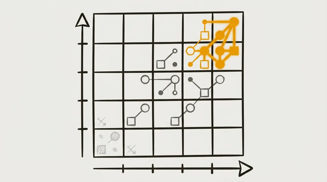
The Total Impact Matrix, as Gilad describes it in that article, is simple. Draw two axes. The main axis is user value. The second is business value. For everyday use, cut that canvas into three rows and three columns, like a tic-tac-toe grid: low, medium, or high on each side. Bottom-left is low user value and low business value. Top-right is high user value and high business value.
Then the work is placement. Estimate where each subject or project sits, and put it on the matrix. The same canvas works inside a single subject. If you are redesigning onboarding, you probably have a pile of ideas that could onboard people better. Place those sub-proposals on the same grid. That is how you decide where effort should go if you want maximum impact.
For me, that in-project use is often the most interesting one. It is how a designer multiplies the impact of the design we produce: kill what is low-impact, and focus our effort — and the developers’ — on what will bring value to the user and to the business.
How to Read User Value vs Business Value on the Matrix
Low on both is usually not worth it; high on both is the win-win; the real job is keeping a mix so neither axis quietly kills the product.
Once the map is filled, interpret it as large zones, not as nine tiny boxes.
Low user value and low business value usually means incremental improvement, or something with so little contribution it is negligible. For work in that cell, ask whether you should invest energy there at all. What will the maintenance cost be? If the value is low and the upkeep is high, you may just be creating problems. How much complexity will it add for the user, or for future improvements? When you are weak on both scales, question the proposal entirely.
Medium or high user value with low business value means you are filling boxes of pure user satisfaction. The questions change. How do you make sure this does not hurt the business, or even hit it negatively? How do you keep that satisfaction over the long term without having to kill it later for financial reasons? And how do you counterbalance it by adding business value another way?
Low user value with medium or high business value is the opposite corner: business-first, with the user a little forgotten. Features like this are sometimes needed. The job is to make sure you do not hurt the user — or that you do not hurt them at all — and that you keep satisfaction and retention over the long term. If you add business value at the user’s expense, you can destroy business value instead of creating it. That balance is genuinely hard.
High user value and high business value is the ideal: strong value for the company and for its users, a win-win for everyone. Those projects are often more costly, so you still have to ask whether the internal effort is worth the impact. This is still the zone you most want to be in.
That does not mean you only prioritize work that scores high on both. You need a mix. Too much business focus risks retention over the long term. Too much user focus risks the viability of the product — and user satisfaction does not help much if you have to shut the product down. It is worth running this map every quarter, or on every project, to see where you actually put your focus and where the next round of work should rebalance.
It is also a good retrospective. Take fifteen minutes to half an hour, place the last five or six subjects you shipped, and you will see whether you lean toward one axis. Then you can decide whether that bias still makes sense.
Quick check
Should you only prioritize features that score high on both user value and business value?
High on both is the zone you most want to be in, but a product that is only business-focused risks retention, and one that is only user-focused risks viability. Map regularly and rebalance.
The 3×3 version is still incomplete. When we ship something, impact can also be zero, or negative — on user value, on business value, or on both. To make the matrix match reality, add a fourth and fifth row and column: a zero line (no impact on the user, or no impact on the business) and a negative line. You now have a 5×5 grid from negative to high on each axis. Re-run the same placement exercise. New readings appear.
Zero or negative on both the user and the business is the obvious cut: you do not want to keep that kind of feature. Positive user impact with negative business impact is risky, unsustainable growth. Ask whether you put time limits on it, and whether acquisition or another reason actually justifies that kind of work. Business impact with negative user impact means you are lowering product quality and risking churn in the medium or long term. That again is a signal to rebalance the map.
I would rather work with this second version. It is a little more advanced, and it is much closer to how products actually behave. Yes, we sometimes do things that are good for the user and bad for the business, and the reverse. A 5×5 is how you see that clearly.
Use it upstream, to prioritize at the level of a project or a solution. Use it downstream, once you have concrete data, to place the thing precisely and decide whether to iterate, keep, or kill a product, a solution, or a feature. It is a 5-by-5 grid. It is accessible. It is also a strong format for challenging work with a team.
Place work on the Total Impact Matrix
Click a cell to read that zone. Switch to the 5×5 when you want zero and negative impact on the map.
Business value
User value
Click a cell
Each subject sits somewhere on user value and business value. Select a zone to see how to read it — then look at the whole map for the mix.
Low user, low business
This is usually incremental improvement, or something with so little contribution it is negligible. Ask whether you should invest energy here at all, what the maintenance will cost, and how much complexity it adds for users or for later work. If value is low and upkeep is high, you may just be creating problems. Question the proposal.
User value without business value
You are filling boxes of pure user satisfaction. Make sure this does not hurt the business, keep that satisfaction viable over the long term instead of killing it later for financial reasons, and counterbalance it by adding business value another way.
Business value without user value
This is business-first, with the user a little forgotten — and sometimes you need that. Make sure you do not hurt the user, and that you keep satisfaction and retention. Adding business value at the user’s expense can destroy business value instead of creating it.
High user, high business
Strong value for the company and for its users — the win-win zone you most want to be in. These projects are often more costly, so still ask whether the internal effort is worth the impact. Do not make this the only work you prioritize.
Place it, then read the mix
Estimate this item’s position and put it on the matrix. The useful reading is the whole map: where you put your focus, whether you lean toward one axis, and whether the next quarter or project should rebalance.
Zero or negative on both
No — you do not want to keep this kind of feature.
User impact, negative for the business
This is risky, unsustainable growth. Ask whether you put time limits on it, and whether acquisition or another reason actually justifies this kind of feature.
Business impact, negative for the user
You are lowering product quality and risking churn in the medium or long term. Rebalance the map so user value and business value stay in a viable mix.
Final Thoughts
The designer who only delivers user satisfaction is working with an incomplete brief. Interfaces that function are the floor. Impact — for the people who use the product, for the people who benefit from it, and for the business that has to stay alive — is the actual job. The Total Impact Matrix is a 5×5 because reality includes zero and negative, not just “more value.” Place the work. Kill what does not earn its keep. Keep a mix so neither axis quietly ends the product. Then do it again next quarter, with better data.
Get the next article first
Every new article, plus my weekly handpicked product nuggets.
Or only the blog posts via RSS:
FAQs
What is the Total Impact Matrix in product design?
It is a grid with user value on one axis and business value on the other. Itamar Gilad introduced it in his article The Total Impact Matrix – Beyond Blind Bets (https://itamargilad.com/impact/). You place projects or in-project ideas on it to prioritize work, kill low-impact efforts, and see whether your mix leans too far toward users or toward the business.
How do you simplify the Total Impact Matrix for everyday use?
Cut the canvas into three rows and three columns — low, medium, or high on each axis — like a tic-tac-toe grid. Bottom-left is low user value and low business value; top-right is high on both.
Should you only ship features that score high on user value and business value?
No. High on both is the win-win zone you most want, but you need a mix. Too much business focus risks retention; too much user focus risks the product's viability.
Why add zero and negative impact to the Total Impact Matrix?
Shipped work can have no impact, or a negative one, on users, on the business, or on both. A 5×5 grid makes risky unsustainable growth and quality-dropping bets visible, which is closer to how products actually behave.